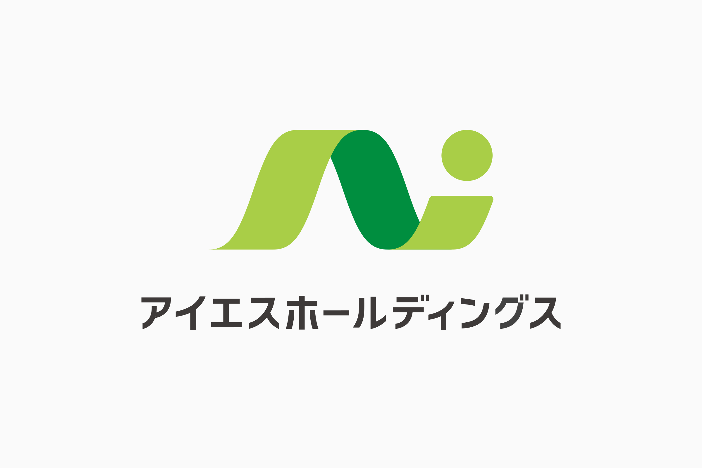
不動産フランチャイズからの独立に伴い、ロゴマークのリニューアルを担当しました。
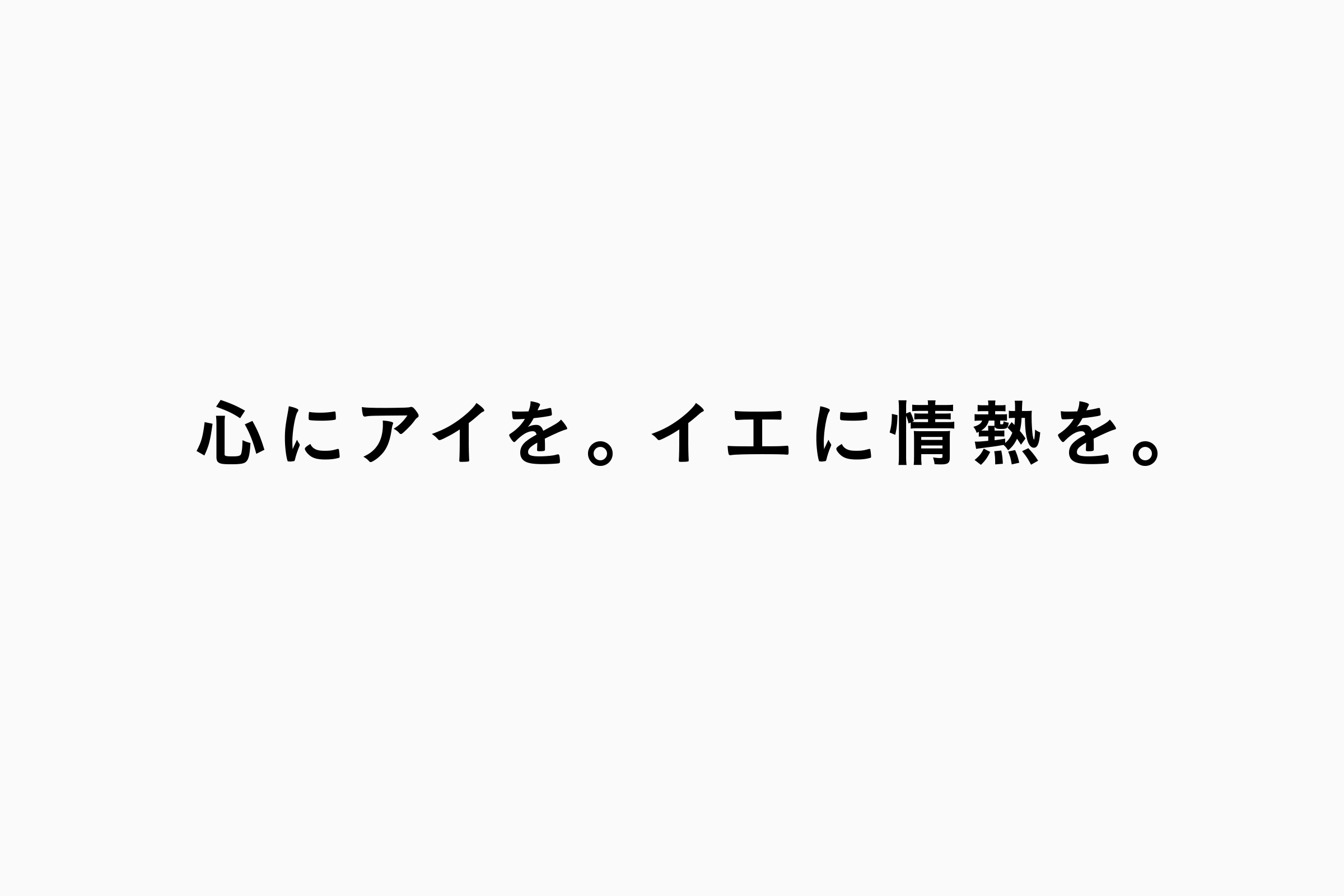
ブランドステートメントの策定をはじめ、各種コミュニケーションツールの企画・制作など、MOOIがこれまで伴走してきたブランド構築との一貫性を軸に、タグライン「心にアイを、イエに情熱を。」に込められた「アイ=愛=Ai」を、途切れることなく続くひとつの流れとして表現しました。
お客様との出会いからその先の暮らしまで、人生の一大イベントである“不動産の売買”に関するすべてのプロセスに、愛を持って誠実に向き合う姿勢を表現しています。
「奇をてらうことはせず、王道感のあるデザインで信頼を築きたい」というオーダーに応え、流行に左右されない普遍性と、不動産会社としての安心感を備えたシンボルへと刷新しました。
With consistency across the brand as a guiding principle, MOOI designed the symbol as a single continuous line inspired by the values embedded in the brand tagline.
The flowing form represents Aies Takken’s commitment to building lasting relationships and supporting clients with sincerity throughout every stage of the real estate journey—from the first encounter to life beyond the transaction.
Responding to the request for a timeless and trustworthy identity rather than something overly distinctive, the logo was refined into a symbol that conveys both reliability and reassurance.
Art Director|Daisuke Takada
Client | アイエスホールディングス株式会社